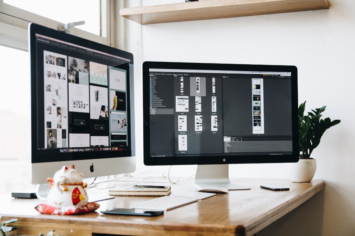
Being a graphic designer is one thing. Making sure that you keep up to date with all the latest graphic design trends is quite another thing entirely. As a graphic designer, you really can’t afford to be off your game even for a single second. Because you don’t want your designs to appear outdated do you?
Graphic design trends don’t stop and start in accordance with the calendar year. Some should perhaps be taken with a grain of salt. However all designers need to at least be aware of the direction that design is going in (if only to explain to a client why a certain trend ISN’T right for them).
Here is our take on the graphic design trends that you need to take into account right now! There are also loads of graphic design courses around to be able to get you up to speed.
90s Nostalgia
It seems like it was really not that long ago that popular media such as Stranger Things brought 80s nostalgia back into the mainstream, escorting in an era of gothic serifs, neon colours and vaporwave landscapes. In 2022, the retro revival has finally landed on the 90s (having also recently been romanticised in Netflix’s Fear Street).
The 90s are coming back in a number of incarnations. However this particular trend hinges on nostalgia—that longing, idealised gaze backward. Thus, we are reexperiencing the 90s through Memphis design patterns, very simple emojis and primitive internet frames. Warm childhood memories reign supreme through bright colour blocks and dripping slime. Whenever your design project calls for a feeling of comfort with a touch of old-school cool, turn the clock back to the 90s.
Abstract Asymmetrical Background And Patterns
In 2020, the geometric pattern style gained popularity through Abstract Geometry and this popularity continued to rise in 2021. With the influence of creative pragmatism, you should expect to see more creative usage of icons to come up with abstract, asymmetrical patterns.
Brands In Motion
Whether you’re strolling past a digital billboard, scrolling through a website – alternatively – navigating an app, more and more we’re seeing motion design at the moment. And most people in the profession believe that this can only be a good thing.

It feels as if static graphics aren’t cutting it nowadays – it’s move it or lose it. With the constant introduction of fresh and ground-breaking digital platforms – as well as the rise of virtual reality – brands are finding novel ways of living online. This has opened up new possibilities in terms of engaging consumers via motion and animation as well as opportunities to better the way we look at storytelling.
This trend is even having an influence on static materials, such as packaging. QR codes were all but dead and buried until the COVID-9 pandemic however now people have that behavioural understanding of ‘scan for information’.
What that means for AR, as well as how its relationship with packaging may develop, is exciting. There will be a significant rise in innovations in order to extend the movement of a brand online to the shelves.
But why is motion so crucial anyway? On a superficial level, a static image isn’t able to compete with a looping gif. On a deeper level, movement establishes identity, just like how we can identify a salsa dancer as opposed to a hip-hop dancer. The dancer could be the same however their motion tells the story.
A brand is now able to have own-able choreography, or a behaviour, which provides tremendous personality, all enabled the screen. This movement has significant implications on the design industry. Design and motion are fused. To make relevant work, designers need to develop a rich understanding of movement, rhythm, and time in combination with skills in motion software on top of all the traditional design skills.
Eco & Nature
The incorporation of environmental imagery in designs has been one of the most important branding and visual identity trends in recent times. Everything under the sun from product packaging to website design is being impacted natural colours, shapes as well as patterns.
There are a couple of explanations behind the popularity of this trend.
- For one thing, it provides designers with the chance to bring some natural beauty and tranquillity into an otherwise busy environment.
- Furthermore, natural imagery is often associated with pleasant concepts such as innocence, clarity as well as calm, which can help in generating positive associations with your brand.
Expect to see a significant emphasis on biodegradability, non-permanent inks and finishes together with a shift away from bold, sophisticated, and perfectly preened design in favour of a more community-based, DIY approach to graphics, imagery, and motifs.


